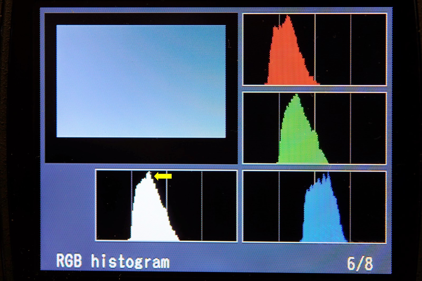
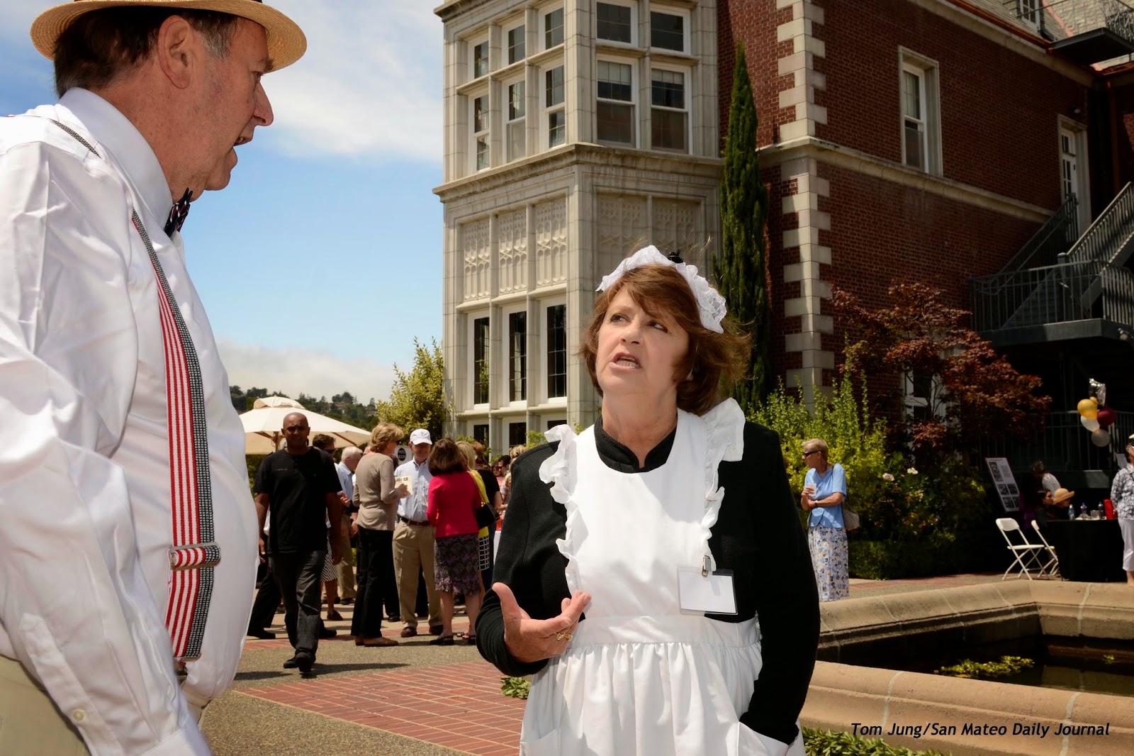
Sunday, August 31, 2014

Gretchen's Dress

Sorry gang, this is it. I'm writing this after spending nearly 4 hours to get this photo of Gretchen's Quinceanera dress for her album. This has been something of a matter of pride, since my first effort was a disaster. Now I'm not holding this image up for it's esthetic merit, but rather as an example that things aren't always as easy as you might think. 

This photo has a history. Three weeks ago I tried to make the photo, but while I was satisfied with the lighting, the original background and the visual concept didn't make it. My go-to blue background was more distracting than helpful, and even though I struggled mightily to get things done right, nobody liked the image. The main problem was my initial concept: I had created an image where the disembodied dress floated in front of the background, without any sense of context. It was actually rather spooky, since it looked like the Invisible Woman was wearing it, or should I say "floating" in it. Well, at least the colors looked pretty good. Here it is (Photo #1).
Photo #1
There were some things I liked about this shot. The blue background was very forgiving about exposure, since one could light it up or down, depending on how the final produce was going to look. The mottled background makes it difficult to see any wrinkles in the background, so I wasn't obligated to drench the backdrop in light. The blue compliments the golden "campaign" color of the dress. I believe I used a gridded softbox for the shot, which helped to show the fine details in the dress. 

This "floating in space" look was a visual dead end. Some friends suggested that a hanger would add some context, so I bought some satin hangers just for the shot. I still didn't like the idea of the dress hanging from the loops, so I decided to hide them with flowers. I went to a local craft store and purchased a red rose garland, along with some light colored "stemmed" roses, and a single pink, long stem rose, just in case.

Photo #2
Prepping the dress was a major job. First, I had to close the gown from behind. Like a bridal gown, it laced from the back. As I would only be photographing the front, I used some cable ties to close up the back (Photo #2). Next, I found some cardboard and made a tube to slip inside the bodice to give it some shape. I realized that all of this preparation was actually turning the dress into a giant flower pot, which would allow me to hang the red rose garland more easily. 

Photo #3
When I placed the garlands on the dress, it looked a little too "wedding", so rather than rely on the pink roses alone, I just let a few red roses peek over the edge, using the pink and violet "stems" to give the arrangement a little elevation. A flower arranger I'm not, so I pushed the flowers in as best I could. Here's the final arrangement. Because so few red roses are visible, the arrangement doesn't shout "wedding". Photo #3 was a quick available light shot made from ground level. The dress was actually hanging from a boom to keep the dress off the ground. More on that later.


Photo #4
This shot was made with a fish eye lens with the camera almost inside the dress. If you look closely, you can see the cardboard tube that I used to give the dress its shape (Photo #4). I did tape the roses together to make them easier to handle and to keep them for falling through the cardboard tube onto the floor. This gave me the idea for the single rose on the ground at the base of the dress. Whimsical, perhaps, but I could always clone it out if Gretchen doesn't like it.

Photo #5
Big Problems: The biggest problem was the background (Photo #5). I purchased an inexpensive white muslin background, which I thought would be much easier to use that the traditional paper rolls I once relied on. The biggest problem in the shoot was providing enough light to make the creases disappear. This was harder that I would have guessed, since the cross light arrangement I used (2 Nikon speedlights on each side) couldn't completely eliminate those darned creases. As a result, the power output was boosted to the point where it affected the overall contrast of the image. You can see that wrinkles are still visible in the upper right hand corner, so I adjusted my camera left lights to provide more light. In the end I got what I wanted, but the exposure pretty much blasted the exposure off the right side of the histogram. The overexposed white background allowed some light to pass through the dress, which hid some of the subtle detail.


Photo #6
Hanging The Dress: The dress was hung from a boom arm of a very sturdy light stand, weighted at the base with a 25 pound dumbbell and counter-weighted with a Norman B200 battery pack (Photo #6). I knew I could easily clone out the boom. The wrinkles on the floor were another matter. There wasn't any way I could get enough light on the floor to completely eliminate them, so I know there would be some heavy retouching involved. The final shot is shown below (Photo #7). Remember that the camera is mounted on a tripod, and the focus locked manually on the dress.

Photo #7
The Red Rose. Getting the rose in the shot was easy, but providing enough lighting to erase the wrinkles wasn't . In this shot, you can see that I could just swing the boom and moved the dress out of the way, and use a single softbox, held directly above the rose, to remove the fabric shadows on the floor covering (Photo #8). 
Photo #8
In theory, the two rose images were perfectly aligned. Here you can see the Lastolite EZ Box with a speedlight being used to add some optimistic top lighting.


Again, here's the final shot after the two images were merged and treated to lots and lots of cloning. Once again, I have  a dress floating in space, but not nearly so spooky with the hanger and the flowers.

This was a lot of work for an image that could have been and easy shot if I raised the dress and the background and eliminated any hint of a floor beneath the dress. But If anyone asks about the juxtaposition of the rose beneath the dress, I can truthfully answer that it was really there, and can claim that it wasn't Photoshopped in place. This is also true if you ignore the extensive post production the image required.

My take-away from the project was an appreciation of the difficulties of getting a crease-free, shadowless white background. It would have been easier if a roll of background paper was available, but weight and portability issues would have made the option impractical in the extreme. I probably need to explore a different way to store fabric backgrounds, or at least find some way to relax the wrinkles. I learned a lot, but it came at a high cost.

I just hope Gretchen likes the shoot. Now on to the rest of the accessories.

Sunday, August 24, 2014

Nikon's High Speed Focal Plane Synchonization

Photo #1
Happy Sunday.

For a lark, I decided to see just how much lighting was lost when you enter the realm of High Speed Focal Plan Synchronization, aka Auto FP synchronization (Photo #1). There has been a lot of talk about how much light was lost when Nikon shooters used this feature to boost their flash synchronization speeds to accommodate unusual lighting or exposure conditions.

As you may know, most digital single lens reflex (DSLR) cameras have a maximum flash synchronization speed. In most cases, it is 1/250th of a second, 1/200 in some of the older models. There are exceptions. The Nikon D50, D70, D40, and the D1/D1X/D1S bodies have the ability to synchronize flash any shutter speed, so long as the burst of light provided by the flash is shorter in duration than the desired shutter speed, and some way can be found to trick the camera into believing that no flash has been attached. For example, my D70 will properly synchronize at 1/1000th of a second only if I reduced the flash output to 1/4 power. Any setting higher than 1/4 is just wasting light.

Photo #2
The methodology for my test was simple. I set a Nikon D80 body for Auto FP Synchronization, and mounted an SB-700 speedlight set to manual 1/2 power in the hotshoe. I selected a low ISO value (100), and a small aperture (F 22) for the camera. Next, I photographed a nearly white wall, and then viewed the histogram in the Playback mode. I then opened the aperture by 1/3 of a stop, and shot again until the histogram's peak was aligned with the third index line (Photo #2, yellow arrow). 

Photo #3

Next, I changed the shutter speed to 1/400, normally one stop of underexposure. But when I made another exposure of the wall, the histogram showed a significant shift to the left (Photo #3, yellow arrow). Based on this visual indicator, I re-shot the photo, opening the aperture up at 1/3 stop increments, until the histogram's peak returned to where it was originally. I simple wrote down the amount of the necessary correction, and resumed the exposure sequence, shooting at 1/800, 1/1600, and 1/3200 of a second exposures.


Shutter Speed

Compensation from Base Line

1/200

------


1/400

2.0 stops
2

1/800

3.0 stops
2+1

1/1600

4.3 stops
2+1+1.3

1/3200

6.0 stops
2+1+1.3+1.7

It suffices to say that FP Synchronization requires enormous amounts of power, since so much is wasted, especially at the higher speeds. And you need to keep in mind that you can add a second flash when you need an additional stop of exposure, but when you need two stops, you'll need a total of four. Still, if you gotta have it, you gotta have it.

If you want to see Joe McNally, the master of High Speed Synchronization, click on this link and watch him at work. Be sure to check out the You Tube video. I dare you to count the number of speedlights mounted on his "Tree of Woe".

Sunday, August 17, 2014

Happy Birthday Kohl Mansion!


Photo #1: 1/250, F 11.0, ISO (equivalent) 100
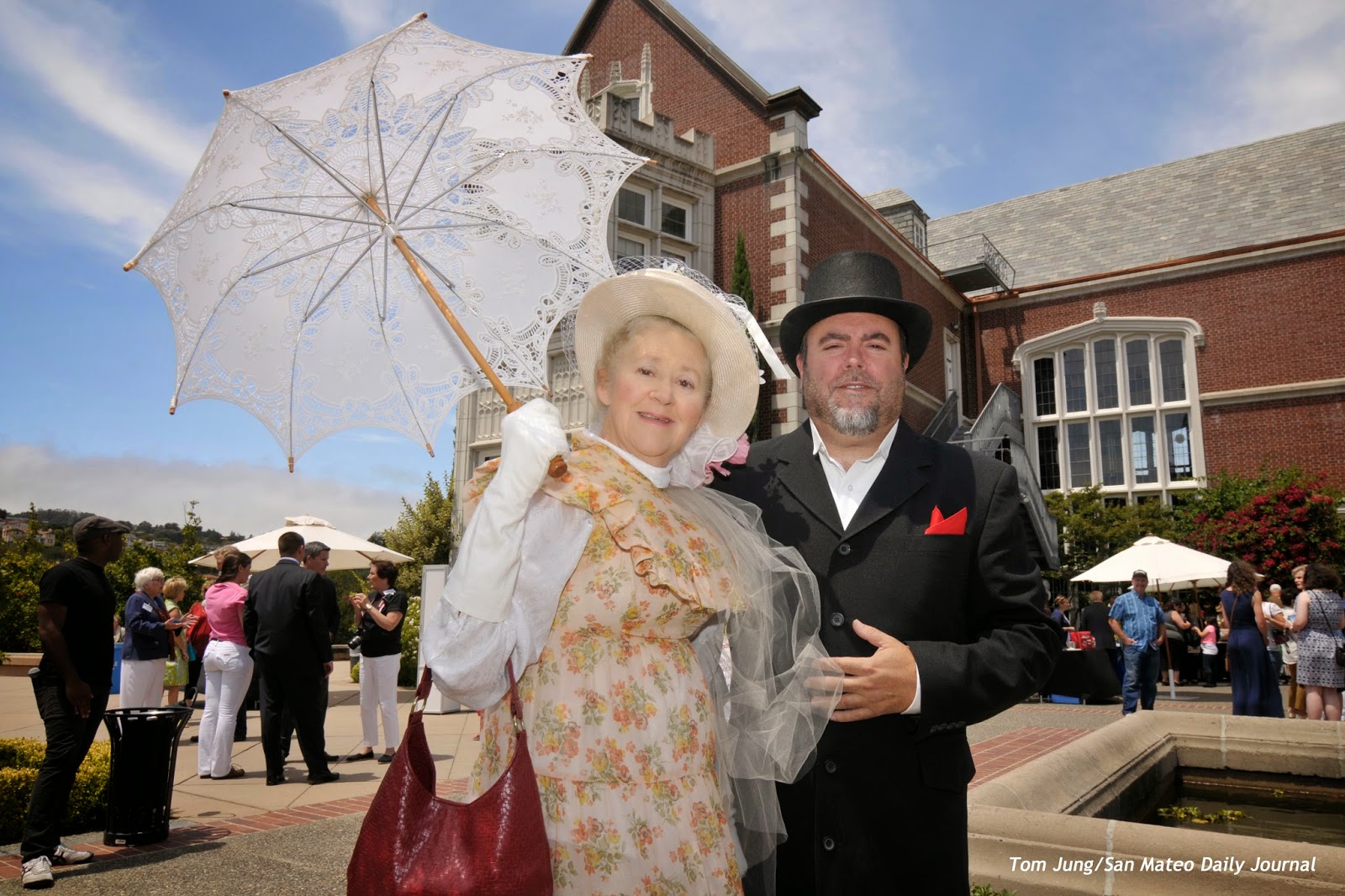
This photo is Right Out of Camera, and has not been altered in any way, save the credit line layered into the lower right hand corner. It was taken at the Kohl Mansion in Burlingame during its year-long 100th Anniversary Celebration. Guests were invited to wear period correct clothing, as this couple did. The shot, made soon after my arrival, became my first-choice submission after I learned that the gentleman was the Vice President of the Burlingame Historical Society. The parasol, the blue skies, and wispy clouds made the photo. An explanation of the in-camera exposure tweaks will follow.

Posed or Directed? This photo was not posed, but instead directed. Before making the shot, I introduced myself and explained that I wanted to make a photo with the mansion in the background. Once they were in place, I adjusted my position until the edges of the parasol weren’t clipped. The photo was a keeper in a single take: I examined it with a Hoodman Hood Loupe, and found the image totally satisfactory. Even so, I continued to photograph for another hour, since you never know when a better image might come along. Having this shot in the can gave me a chance to relax and look for images that might prove more interesting. I did make some additional exposures, but I already felt I had taken the winner.

Automated Exposure Settings: Although I had an E-Z Box in the trunk of my car and my Zumbrella on a Monopod on my belt, I just went with on camera speedlight fill. For today, I set my D300 as follows: 
  • Lens: 11-16 2.8 Tokina.
  • Exposure Mode: I set it the camera to Shutter Priority at 1/250 of a second (the highest normal sync speed).
  • Exposure Compensation: Exposure Compensation on the body was set to -1/3 of a stop, which helped to darken the sky and bring out the clouds.
  • Aperture: Set by the camera. Depending on the background, the aperture ran from F11 to F8.
  • ISO: The ISO on the D300 was set to L 1.0, which is 1 full stop below the minimum ISO 200 setting, giving me an effective ISO of 100. I have no idea why Nikon doesn’t just call it ISO 100.
  • Speedlight: A Nikon SB-800 was shoe-mounted and was set to the standard TTL mode with an exposure compensation setting from -1 to -2 stops. I don't recall the exact compensation used for this photo, as it isn't included in the EXIF data as viewed via the File Info option in Elements. I can't say if the data could have been retrieved with other software.
Photo #3: Shutter Priority, 1/250, F9.0, ISO 100

Flash Exposure Variations: I made Photo #3 a little later in the day. It illustrates a slightly different lighting arrangement. Notice that the natural sunlight played a more important role in lighting the front plane of my subject's face. If I were to make the photo with a Flash Exposure Compensation setting of "0", the light would surely overexpose the right side of my subject's face. Here, the Flash EC must be set much lower. How much? This is probably a salt to taste adjustment. Too much light and you will the burn out the highlights. Too little and you risk losing detain in the shadow side of the face. I think I found the "Goldilocks" Zone: Not too hot, not too cold, but just right!

You can see from this enlarged section that the shadow side of the face was filled enough to bring out the detail, but the highlight side of the face is pleasingly rendered. There are some other graphic elements in the image. My heroine is placed close to the center of the frame, but not on it. The immediate background is the shadow side of the Mansion, which helps bring some separation for her face. Her protagonist at camera left helped to frame the image, and his gaze brought the viewer's attention to my main subject. This wasn't as compelling (or attractive) an image as my first choice, but served as a good example of the fluid approach to exposure that digital cameras allow. By chimping after the first shot, you can make some quick adjustments based on what the results. Of course, familiarity with your exposure options will make it easier (and faster) to achieve the "just right" image.

While I have been a strong proponent of iTTL flash metering, this is the first time I combined automated flash exposure with automated ambient exposure. I can accept this abdication of exposure responsibility by remembering that I still have control over my highlights and shadows. Shadows can be controlled by using the flash exposure compensation, the highlights controlled by exposure compensation on the body. By starting off underexposed on both controls, I can get satisfactory results (usually) on the first shot, and with some minor adjustments, a much improved second one.

Life just got better.