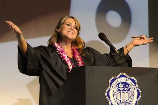
One of my students asked for some direction in photographing events in auditoriums or other large, artificially lit venues. Let's look at some of the most commonly encountered problems . This sample photo was made in the College of San Mateo auditorium during the 2010 San Mateo Adult School's graduation ceremony.
Lighting: This is a no-flash situation, so you must rely on the exiting lights. As I said in an earlier post, the "Nose Knows", so I would suggest that you shoot only when the subject is looking towards the light to insure some detail in the eyes.This can be difficult when photographing inexperienced speakers who are probably won't make eye contact with the audience very often.
ISO Settings: You should expect to use high ISO settings when shooting indoors, but don't go overboard. Use the lowest setting you can get away with. Remember that the higher the ISO setting, the greater the effects of noise on your images. Your camera's built in noise suppression may not be as effective as a post production fix, so you would be well advised to turn the in-camera noise adjustment to "low", or "off". I try to stay at 1600 or below, when I can.
White Balance: You can bet that some sort of incandescent light source will be used. If you cannot set a custom white balance, you must rely on your camera's presets. for this photograph, I set the camera to the incandescent white balance preset. You can always make minor corrections after the fact using the photo editor of your choice, the route I normally choose.
One unique lighting problem occurred during this assignment: A digital projector was used to position an image of the school's logo behind the podium. The color temperature of the projector's bulb was significantly cooler that the spot lights aimed at the stage. Had I relied on the camera's automatic white balance setting, the correction would have probably been confused by the the two different light sources, and the subsequent difference in color temperatures. I decided to stay with a setting that gave the most pleasing skin tones, which is why I stayed with my original Incandescent preset.
Lens Selection: Most people will start their digital careers using the "kit" lens that came with their cameras. While these lenses are often quite sharp, they almost always have maximum apertures that vary with the focal length. For example, the 18-55mm Nikon kit lens has a maximum aperture of F3.5 at 18mm, F4 at 24mm, and F5.6 at 55mm. If you are so far from the speaker that you are forced to shoot at a focal length of 55mm, you will working with a very slow lens!
There are two relatively inexpensive lenses that will serve you well when used indoors: the F1.8 35mm and the F1.8 50mm lenses. The 50mm gives you a slight telephoto lens (about 75mm in 35mm terms), and nearly a 3 f-stop increase over your kit lens at the same focal length.
Depending on how important these shots are, you may choose to buy or rent a more suitable lens. There are a number of different available rental outlets, but a local source, Borrowlenses.com, is worth checking out if you live in their service area.
Shutter Speed Selection: If you are photographing an animated speaker, you'll need to pick a shutter speed brief enough to stop the action on stage. I generally start with my lens wide open and see what shutter speed freezes the action sufficiently.
Aperture Selection: Shutter speed and aperture size go hand in hand. However, all lenses will perform better when stopped down. 3 stops smaller that the maximum aperture used to be considered "golden", but even 2/3 of a stop will often produce a noticeable improvement. Shoot your lenses wide open when you must, but stop down a little bit when you can.
The lead photo was made at 1/160th, F4, 1600 ISO. First, I set my camera to Aperture Priority with the lens wide open and made a close-up of my hand while standing near the front of stage. I was careful to insure that the lighting on my hand match the lighting on the speaker. If I was happy with the exposure, I set the camera to Manual and set the shutter to the speed chosen by the camera.
Incidentally, your lens aperture size and shutter speeds will default to 1/3 stop increments in most cameras. So if you stop down your lens by two clicks, increase your shutter exposure by two clicks.
Vibration Reduction: VR, as the Nikon People call it, is advertised as providing gains of two to three stops. One can then infer that if your best efforts yield acceptably sharp images at 1/60 of a second, the VR feature, when turned on, will allow you to shoot a 1/15th of a second with similar results. This can be deceiving. You may be able to hand-hold your VR equipped camera at 1/15 of a second, but if your subject is moving quickly, you'll get a good dose of motion blur caused by the subject. It's unfortunate the VR seems to be the big thing with variable aperture super-zooms that lose maximum aperture size when you increase the focal length of the lens. Any gain in longer shutter speeds is offset by the smaller maximum aperture at the long end.
Monopods: One desirable addition to your equipment collection is a monopod. While inexpensive ones are satisfactory for "flash on a stick" applications, you will need to pay more for something sturdier if you expect to support a camera while photographing in low light. Monopods have the advantage of being totally usable from a sitting position, and they don't require a large footprint like a conventional tripod. While you must still employ good, steady, camera holding techniques, a monopod will both tame those camera shakes considerably, and support the camera's weight during those long periods spent waiting for something exciting to happen.
One final word of caution. There are some instances where event photography is unethical, illegal, or just plain rude. My presence as a photographer was sanctioned by the sponsors.
The Nose Knows. It should become apparent that I really like having my supplementary light source "on a stick". This gives me some flexibility on the placement of the light in relationship to my subject. You can position the flash to the left or right, or above or below your subject, whatever the situation may call for. But whether your light source is artificial or natural, you can establish a good foundation for effective lighting by aligning the light with your subject's nose.
This lead shot was taken early in the morning during Carnaval in 2008. From the shadows on the street, you can see that the light was coming from camera right, almost perpendicular to the line of sight. Had she been facing me, half the face would have been in shadow and half would be fully illuminated. But by waiting for her to turn into the sun, I got full illumination on the front of her face, accentuating her strong facial features.

A lucky accident occurred when the sun did double duty for this shot. First, it served as a strong accent light that separated the line of his back from the walls of the building in the background. However, light bouncing off a light colored building across the street gently lit the front of his face, separating it from the background and giving the front of the face a three-dimensional effect. The light is so subtle that you might not believe it was really there until you examine the folds of the front of his red shirt. You'll see that the edge is just a bit brighter from the left side, exactly where our trumpeter is facing.

This final image demonstrates that the "nose knows" even at high noon. You can see from the short shadow on the street that the sun is very high in the sky, and while the puppeteer is facing away from the light, his charge is looking directly into the sun. Again, his nose is pointing directly into the main light source. The strong shadows beneath the chin and nose clearly define the face.
So remember that whenever possible, have your main light illuminate our subject's face straight on. As I said, the Nose Knows!
I was at the San Francisco Museum of Modern Art getting ready to photograph an exhibit of prints by the late Henri Cartier-Bresson. As soon as I entered the exhibit, I made a custom white-balance reading which was, for all intents and purposes, the same as the camera's Incandescent pre-set. After scouting the exhibit for possible photo opportunities, I was directed to Martine Franck, widow of the late Cartier-Bresson, who was discussing the photographs from the exhibit and her experiences as a photographer for Magnum Photos. I decided that I wanted a photo of Franck with one of Cartier-Bresson's better known photos in the background. Because the main lights in the museum were coming from tracks in the ceiling I knew there would definitely be shadows in her eye sockets. I decided I needed a tiny bit of fill light to add some life to her eyes. I thought the SB-800 speedlight in my bag would be overkill, so I decided to use the camera's built-in flash. I knew that the light from the flash would give the shadows a bluish tint, so I taped a small piece of Rosco's Full CTO gel in front of the flashtube. This brought the color temperature down to level more compatible with the current (incandescent) white balance.
I set the flash to fire in the manual mode, at 1/32 power. Since I was shooting at ISO 6400, I did not trust TTL when flying this close to the edge of the envelope. This was just a guess, since I knew that if it was too powerful for the given shooting distance, I could partially cover the flash tube with my finger to reduce the output. As it turned out, the setting was just about right.
In a later post I'll talk about light and lighting, but there thing you should keep in mind: Fill light should never over-power the main light. You use the main light to accentuate form and texture in a photograph. You use fill light to provide detail in the shadows. Don't push your fill light too hard or you'll blow out (over-expose) your highlights.
As you can see from the illustration, it's a small piece held in place with some Gaffer Tape. Gaffer tape is tough and can be attached and removed without too much difficulty. I just position it to fully cover the flash tube.
One last suggestion. Be sure to remove your lens hood when using the pop-up flash. This goes against my belief that the hood should be left on at all times, but when a lens is used at wide settings and short distances, the hood can cast a shadow on the lower edge of your photo, something you'll probably want to avoid.
If you're interested in learning more about color correction gels, I suggest you go to the the best source on the planet: Strobist.com. Click here for David Hobby's explanation on how and when to use gels. You can buy an inexpensive sample pack here.
I always have this gel taped to the back of my press pass, just in case.
 Two of my favorite Daily Journal photos were made in Museums. But whenever I see the two photos together, I am reminded of how important backgrounds are. More specifically, we are talking about the ratio of background to foreground. Both of these assignments were about exhibits that would open shortly, and the purpose of the photo was to promote interest in the exhibit.
The first shot is a photo of Martine Franck, widow of the photographer Henri Cartier-Bresson, whose photographs helped define photojournalism in the post World War Two years. Franck was answering questions about a retrospective showing of her late husband's best known photographs. The exhibit included Behind the Gare St. Lazare, seen behind her.
I wanted to make a photo that showed Franck in the foreground and the iconic image, out of focus but recognizable, in the background. Since she had her well-worn 35mm Leica rangefinder camera with her, I had her hold it in her hands as though she was preparing to make a photograph. Since the museum's lights were incandescent and coming directly from above, I used the pop-up flash on my camera to provide some additional light into her eyes. I adjusted my vantage point to position the famous photo behind her. This is the photo I submitted.
While I was very pleased with the photo, the paper did not run the image, and after discussing it with my editor, agreed with her reasoning. The most important shortcoming was the photo's lack of context. With the single photo in the background, it is completely removed from a exhibit context. In addition, Franck completely dominates the image, making this photo a portrait of a photographer rather than a photo of an exhibit of a photographer's work. No one has denied that it's a good portrait, but it didn't meet the specific needs of the article.
A second assignment came with the opening of Japanesque, an exhibit showing the influence of the west on eastern art. Here Karin Breuer, the exhibit's curator, stands beside the easily recognized color woodcut “Cresting Wave off the Coast of Kanagawa” by Katsushika Hokusai. Luckily for me the light was coming from a relatively low angle so fill-flash was not necessary.
I was fortunate in both the visual elements of the background and the placement of Breuer within the image. The print on the wall is easily recognized, and the exhibit description is visible on the wall beside it. The four smaller prints add to the "museum" quality of the image. I was also fortunate that Breuer was explaining the print's significance to some journalists to my right, thereby anchoring her role as exhibit curator and allowing a more candid portrayal.
The moral of the story is this: Before you set about making a photograph, clarify the message the photo is to convey. That message will often go beyond the simple issues of choosing the foreground subject, since all of the visual elements in the background should help advance the the ambiance you are trying to convey.